Hello, this is one of my latest artworks I made using MyPaint (for the character mostly), I use it in combination with Gimp and Blender which are also very well known freeware I use to make this kind of artworks
Little description: well, this is supposed to be the “Revived from Self-Crucifixion” form of Walter Sullivan (whoever played Silent Hill 4 should know the character). I usually make fan-art when I’m really inspired and lately SH4 was a great game to play and the character of Walter Sullivan (sort of serial killer freak) was extremely interesting to make. The game series itself is a great source of inspiration because it’s about parallel world with nightmares and stuff. This is an a-typical pieces of mine, because I usually make fighting games fan-art (so no people beating each other this time, just one mad freak in its own psychological hell ).
I can’t post more than one, for the rest you can see them at my site: http://emanuelepepi.altervista.org , almost all of them are made with MyPaint + pencil + Gimp + Blender or even Inkscape where vector work was necessary… so all “freeware-based” work.
I hope you like them and, obviously, any feedback/comment/inspirational idea is welcome (kinda lacking of them lately…) !
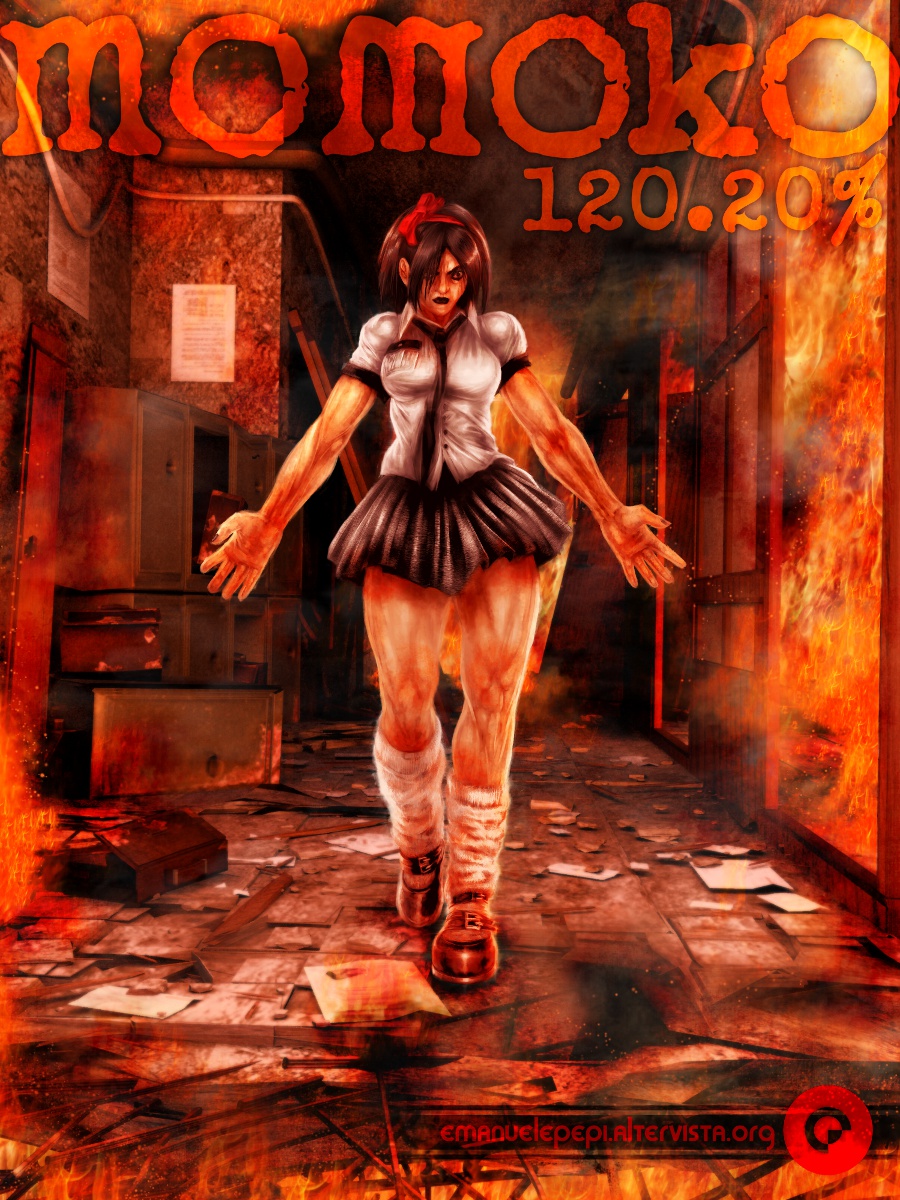
Obviously, also this artwork has required the use of MyPaint (on the character), but also Gimp and Blender and Inkscape were used.
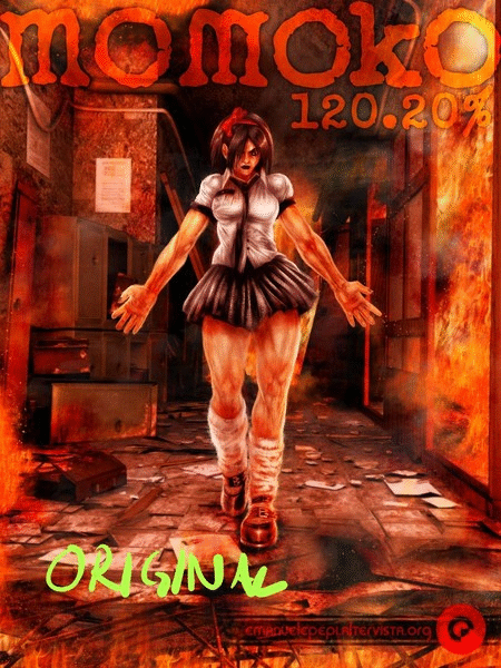
It’s inspired by the 1986 Jaleco’s game “Momoko 120%” … with a horror twist.
Hope you guys like it (even if it feels quite quiet in here… ) !
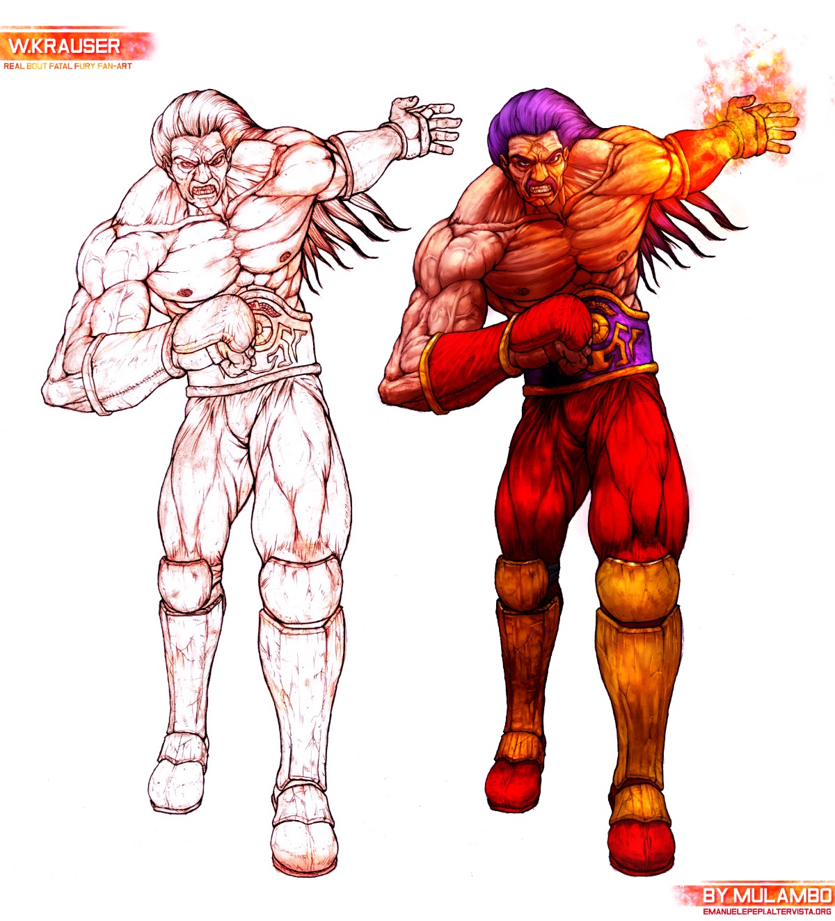
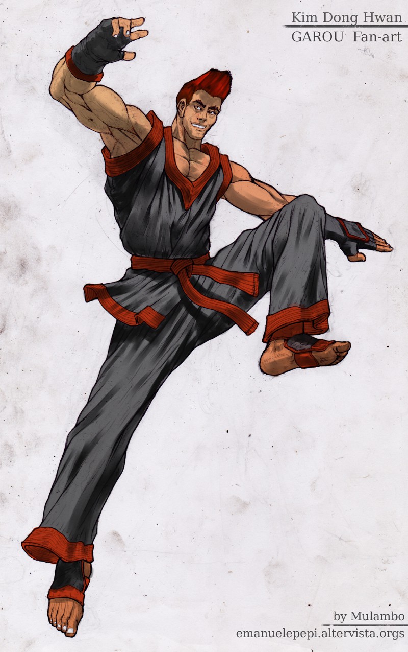
That’s a very cool image (despite the fire). My one criticism would be that the character itself feels very static (I don’t get a sense of movement when I’m looking at it)
And yes, the forums are generally not high-volume in terms of posts. Part of that is probably down to email notifications being a bit flaky sometimes.
thanks for your comment yes, the feeling of static may be due to the front camera/view of the scene. I was just presenting a character so I didn’t want her to do anytthing else than just “being there”
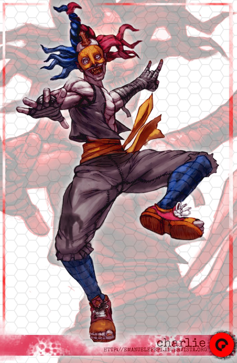
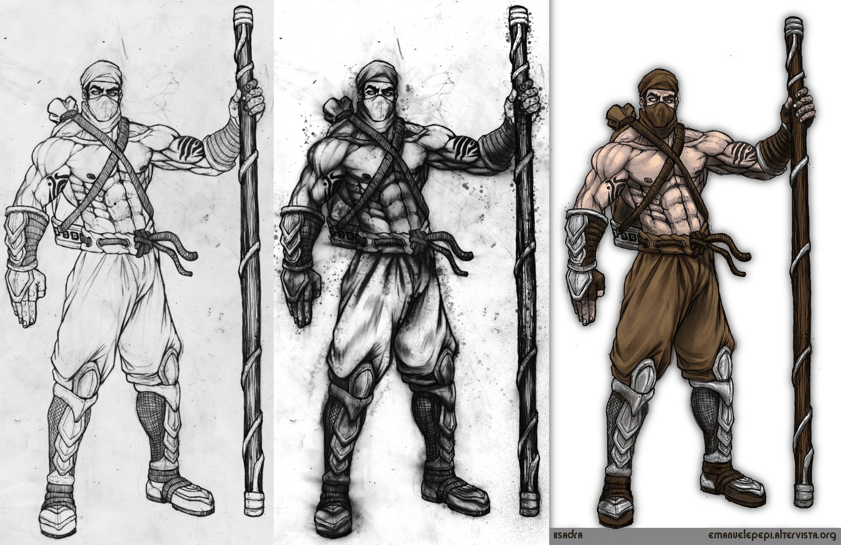
He was supposed to be a full artwork (full painting) but in the end the character didn’t inspire me enough so I left it sketchy as it is (pencil drawing, scanned then painted over on MyPaint, slightly enhanced with Gimp).
He’s name Charlie, after the game “Circus Charlie”, a “horrorization” of the Konami’s char
I also made a stage but I won’t post it as it didn’t require the use of MyPaint.
Yeah totally, they’re fun to make but in the end they’re a great responsibility in terms of focus and I know they can mean a hard time for the viewer. This is why sometimes I make something simpler, just to get out temporarily from the stress of overworking. Such simplicity isn’t totally satisfying though as it lacks of details. I’m still struggling on finding a proper balance between the two forms… some artists like Artgerm and similar ones use a blurred background as technique to focus on the char (with a different, more zoomed view on the subject, mainly the upper body) but I think I’m more “democratic” than that or it’s just not my style…
Well you don’t have to use blur to make it more readable. Using slightly different value ranges is more subtle and can be quite effective while preserving much of the details in the background.
Like this:
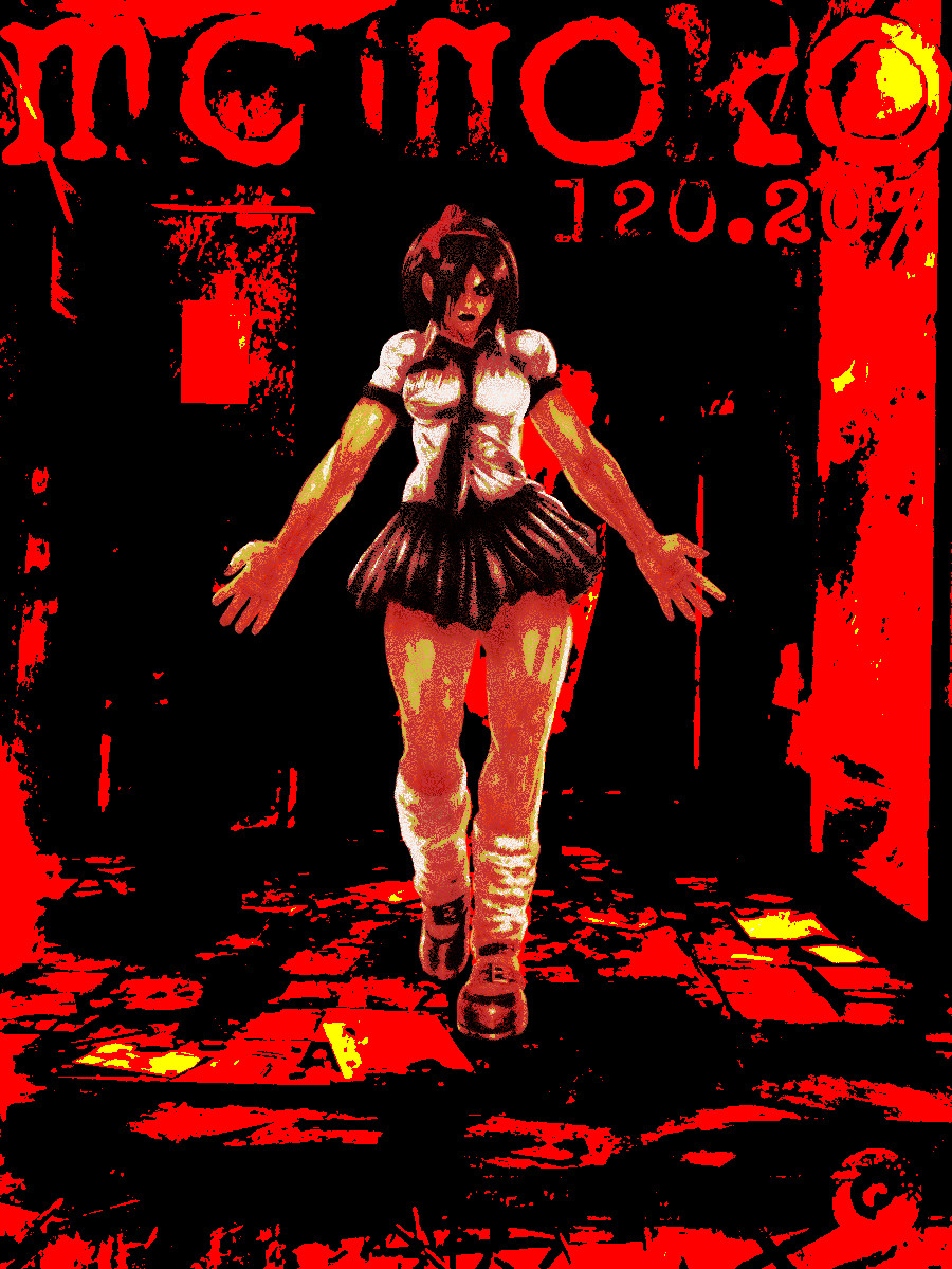
If one were to go for a more graphic approach, changing the hue a bit works great too:
I know, I just devastated all the hard work you put in to make details. Sorry!
Although I do think that the posterized look works quite well with this image.
I hope you don’t mind it too much that I played around with your work!
Hmmm… I see and I guess that’s true, in fact many details look more visible, but I wanted the image to look hot and bright. I mean, it had to look hot, the whole scene is on fire. I think I can apply your suggestion on other artworks where saturation can be lowered a little. What settings did you use for that ?
About the other solarized experiment, yeah, I guess you mean something like Alan Moore’s Sin City (with b/w backgrounds and bright red blotches)… that’s cool indeed, but in the case of that artwork I didn’t want to separate the char from the background. Again, it’s just my preference (I could have also made the fire blue or purple, you know, just to make it look weirder), but I accept the inputs, as they can give me ideas for further works
I don’t remember the exact settings. I took it into Gimp, separated the character and the background on two layers. Then I used the Brightness/Contrast adjustment on each of the layers to compress the values a bit and shift them up and down in brightness. After that it look quite washed out and awful, so I took the Hue/Saturation adjustment to bring the colours back to approximately where they were.
The other image… I don’t know. Maybe I was thinking about abstract movie posters.
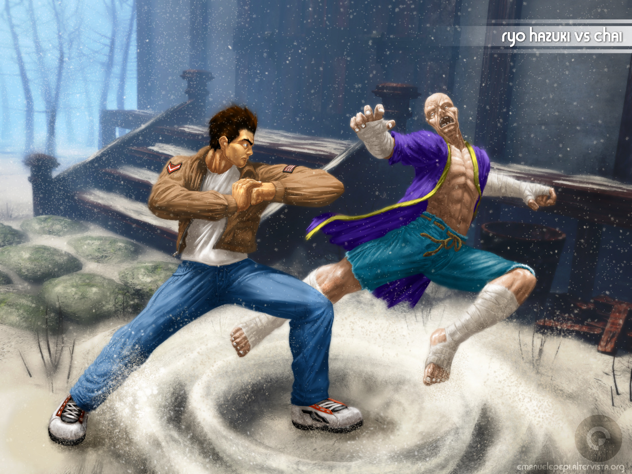
6 months after no artworks… well, here’s something like a comeback
Ryo Hazuki VS Chai (Shenmue fan-art)
Done in Blender (stage), MyPaint (characters), Gimp (various fixes, effects, etc…)
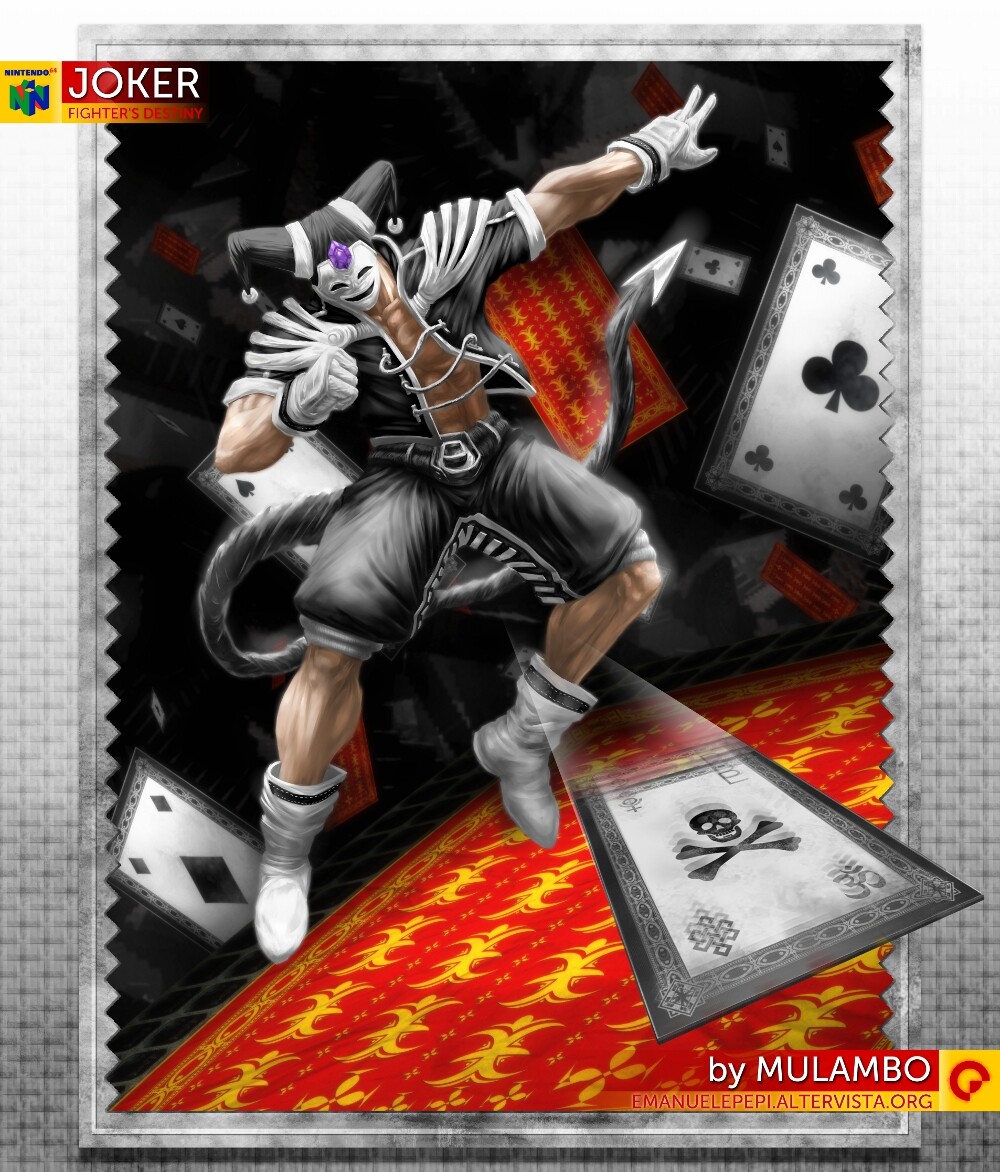
Here’s my new work called Joker ( inspired by a Nintendo64 game character, specifically from the game Fighter’s Destiny )
The character has been made in MyPaint 1.2, the rest with mixed techniques/softwares (Gimp, Inkscape, Blender).
Why don’t my images show unless they’re hosted (one of them is shown, in fact)? Is it a bug of the site ?
Well, in case you don’t see them (like I do on my browser) right click on them and click “View image”… it seems that it doesn’t show the image even by clicking on the empty frame…
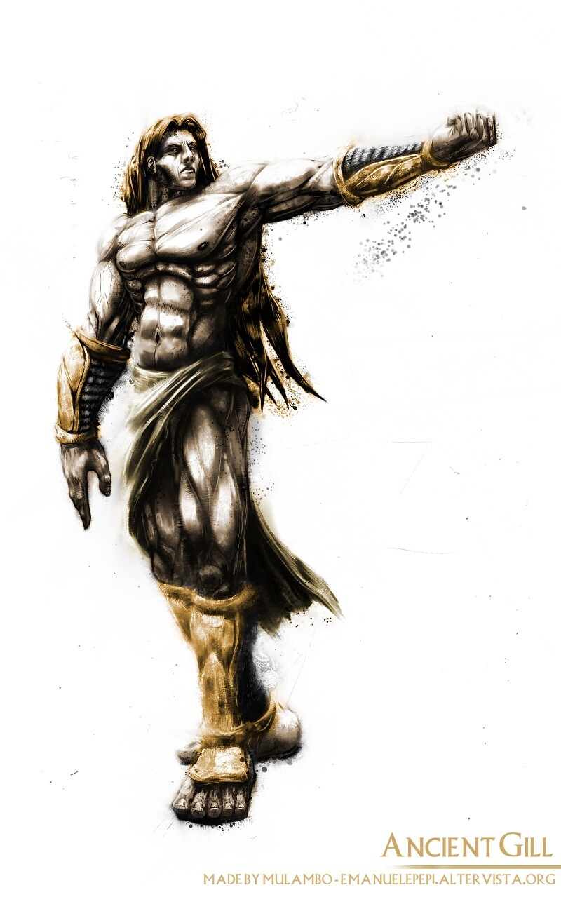
Two new artworks made with MyPaint
Ancient Gill, my re-vision of Gill (Street Fighter 3, Capcom) in a more human form (theorically before obtaining the cryo/pyro powers)
Yeah, sometimes I feel tempted of going back to traditional medias and I’ve also revised the Ksadra artwork because I thought not showing the traditional outlines could have been a waste (they’re nice, afterall), but there’s no Undo button in traditional art
If I fail a hard shading or an outline (with indian ink or darker pencils), for example, I can say goodbye to all the previous work and be forced to follow the “style” of that mistake (using the rubber/eraser can just screw it all worse). Using the outlines as digital base, one can experiment different shading styles, instead, without losing the original copy. Traditional art requires too much cold blood for me… I leave it to action painting style stuff like the ones I posted on my fb page… not going to link it here because it’s not related to MyPaint.