Skull was side-illuminated with one of those cheap IKEA desk lamps with the long flexible neck. Those are pretty handy!
I used the beta Scott Burns subtractive blending mode and the HCY picker extensively. I’d like to think they helped a lot but I’m not about to paint this again without them to find out
Here’s a little ocean scene I did with the real-time HCY adjusters I’m working on (tweaking the existing adjusters). For some styles there’s almost no need to open a palette or pick colors manually from the color wheels. Just a few quick taps can jump you all around the HCY color space. Slow down the taps and create nice gradients. Bump up the saturation in the foreground and you’ve got a stew going.
Another test of the HCY Real-Time adjuster thingies. This painting is actually one hue, that yellow color. I only fussed with the brightness and saturation controls. Color is weird.
Thanks! This was done with a custom “Flat” brush that use’s Anti-Art’s Angular Offset Side ( but w/ Ascension). All my brushes are Here
But, a lot of them won’t work well without all the pending pull requests/beta features. You could try this Flat brush though just fine, but you’ll need to swap the Angular Offset Side Asc with the normal Angular Offset Side since I don’t think you have Tilt on your stylus. The former only works with tilt-enabled pens, and the later works for everything since it is based on movement direction.
Here’s a 10 hour portrait exercise
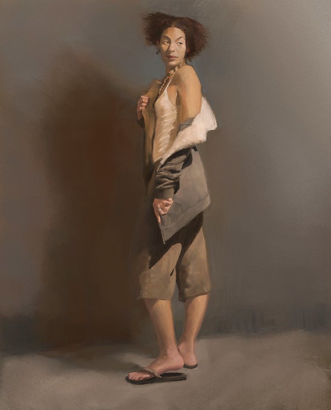
This was a “limited pallete” of just two colors, a yellow ochre and terra rosa, plus black and white. I was surprised at how blue the pants look (it’s really just grey) but the contrast effect of the warm background casts a blue color on it. Here’s the gamut range of the whole thing:
This is when I realized having a high-gamut fancy monitor is probably not really a big deal for doing artwork, at least if you are trying to get a real painting feeling to it.
Thank you! This was from a photo reference, which I don’t think I can share since it was provided by my university. That, and I elongated the man’s head quite a bit and I don’t want anyone to know that.
By the way, this site: http://www.art-paints.com is really cool if you want to create a palette from actual paint colors, since they provide RGB numbers for all the paints for many brands. It seems pretty accurate!
Thanks for the info! I am just starting. Now trying to create a portrait from a photo. Showing your work is a great help for me! That it took you 10 hours of work for one simple thing. So I must be patient for this first time for me
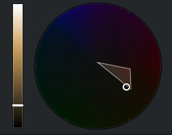
Here’s another one with the same limited 2 color palette. I really don’t use the normal color pickers anymore. I keep the HCY wheel open with my gamut mask so I can try to stay within my limited palette, but to actually pick and choose colors I just use the color adjusters with the swatch overlay. It’s hard to exaggerate how intuitive and accurate this method of choosing colors can be, and I hope to get it included into MyPaint soon.
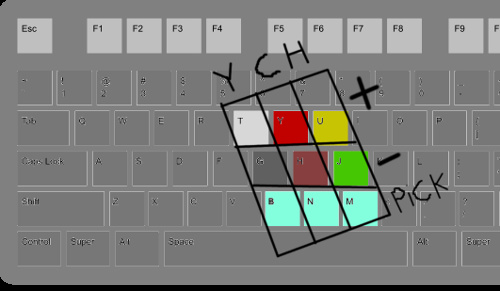
Here’s a keymap that I recommend if you want to try this, assuming you are right-handed and use this kind of keyboard. The top two rows increment and decrement the HCY values. The bottom row “picks” that channel from the canvas (requires this patch). Why did I order them YCH? It seems more ordered by importance. The lightness is probably the most important, followed by chromacity, and then hue. You’ll often read this in textbooks; that value is dominant and hue is really not that important (which is why limited palettes can be so successful)