Having the following settings, I sometimes only get about 90% white. I get closer however if i use a step size like 1 or less. → maybe some rounding to white or close to white could help?
About the black paint being stronger than white I’ll have to do some tests
I think it also depends on the actual medium but I am still wondering whether that would be a good thing. I would personally see that as an inevitable downside of physical medium that you should not have (to have) in a digital medium.
Ah, yep it’s all about step size. I’m not allowing any rgb values >1.0 and totally discarding the gamut-mapped result if it is still >1.0. This is display-referred. Ideally we will move to Scene-Referred and won’t have to worry about RGB >1.0 at all, and when you move the lightness up it won’t ever stop, and you can paint with 1,000 suns.
So, for now this will get fixed when I add those extra optimizers to reduce lightness back to within display-referred range, which will also allow you to click in the striped areas and have it jump to the nearest acceptable value. Do you know OpenGL? I’m going to try to learn how to render the image tiles to an openGL surface of some kind (pyCairo doesn’t support opengl really). Then we can use python+OpenColorIO to get “free” gpu-based color management and scene-referred data transformed for our monitor.
I agree, maybe there is some tweak/power function we can apply to the ratio of the two mixed spectral curves that accounts for this. . .
Or, maybe I’m on the fence. If it behaves like real paint, then it’s going to behave the way traditional artists expect it to behave, and that’s a good thing since artists may have years or decades of experience with paints. A digital painter that doesn’t expect this can just. . . use normal rgb, right?
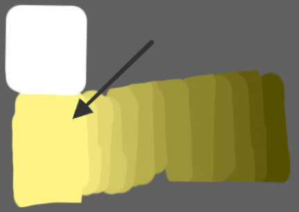
Just in general to get a feel for what I am saying about tinting strength or portions of color, lets talk about creating grays with black and white, to get a #6 on the value scale you can usually mix equal parts white and black, to mix a step# 7 you need to add 4 parts white to 1 part black, to mix a step #8 you may need to add 16 parts white to 1 part black, to mix a step #9 you may need to mix 40 parts white to 1 part black to get to step 10# you may need to add 100 parts white or more to 1 part black. You should see that as you go higher up the value the amount of white needed doesn’t just double or even triple it rises quickly the higher you make the value. This tinting strength principle applies in general to any paint color. if I have a red that is a #6 on the value scale and I want to make it a #10 I could need as much a 100 parts white to one part red.
So, is this kind of what we’re seeing with the spectral/pigment mode? It does sound like a power function. Maybe we should test throwing a power function in there both in the gradient tool and on the smudge engine so that the pressure to smudge ratio response is non-linear
Ok I got the interactive blend mode working on the HCYtools branch. It’s pretty darn cool, I think, Right now it is just Pigment mode, until I build out prefs.
Made some improvements to the sliders performance, and added the minimize function to let us get closer to white even with a large step size. I’m still having trouble with getting the trimming the brightness when using other illuminants. I feel like I need to use a multi-variate optimizer but I can never get them to work well, so just have two univariate minimizers in a row. First trim saturation until within gamut, then trim lightness until within display-referred 0-1.0. I think for now it might be well enough and see how OpenColorIO can handle demands for higher lightness.
Cool, this seems to be similar to what krita is doing in its latest versions. I like that you can go back and forth however. I also tried your function with reversed order (moving away from the target color = less of that color / going closer = more of it) which I found more intuitive. Might be subjective, but maybe give it a try and see how you like it
In both cases I think an indicator line would be usefull (like the preview of the brush-line tool, but simpler), maybe even showing the possible colors in a gradient inside the line?
A different approach that I’d like too, would be to only use pen pressure while pressing a hotkey (similar to the normal color picker). That way you could go back and forth too without having to move the cursor across the screen. What do you think?
Did you revert or overwrite something? because I noticed a bug has returned (that breaks HCY luma slider) for which I made a pull request earlier:
that would be a shame, since the resulting colors are really good besides that “issue”. Maybe that power-function that you have in mind might also solve that brightening-black problem?
I was definitely inspired to work on this by that recent Krita feature. In the past some mypainters had talked about a mixing mode that was similar to this, but not drag based. Oh, I’m not crazy, David Gowers had this idea:
Have you considered the possibility of a weighted combination of old and new colors? Having a GUI with a checkbox and a slider 0%->100% for each component? The checkbox would be equivalent to treating the value as 0% (channel is not factored in at all). Then you could have a single action that just picked with this weighting, rather than one per channel. I’d consider this scenario – mixing some but not all of an existing color into your current color – as one of the most generally common.
So I hope this design is best of both worlds. I’ll have to try the inverted mode, or maybe we can make it a preference. I was thinking the assumption is that you want to modify your brush “a little bit at a time”. With it inverted you’ll have to drag the brush a greater distance each time to make tiny adjustments. Won’t be hard to wrap that in a pref.
I agree, that would be nice. Maybe using cairo gradient, add a few stops? I’m not very good with cairo yet. . . Now you’ve given me another idea… Instead of color picking, what about a line mode actually paints that gradient onto the canvas? You could instantly give shading to objects. . . .
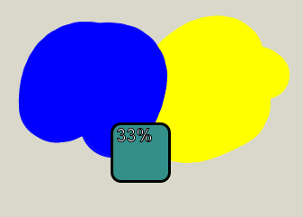
I am trying an option to print the blend ratio inside the swatch, so if you want to go for an exact ratio it is easier. Kinda ugly though, and getting a text color that will work is surprisingly hard without a bunch more code. Adding the outline seems to be best option at the moment.
That would be interesting as an option. It might be hard to dial in to a precise color ratio, and obviously wouldn’t work for those folks w/o a pressure stylus
Ah, yes, I’m not very skilled at git. Somehow I had merged my master branch into the HCYtools branch, and I was cleaning it up. I’ll merge your branch back in. Sorry about that! I want to make sure your contributions have your name attached for posterity (blame)
Might need to also account for the lightness of the colors so that lighter colors do not have their ratios tweaked… ouch, brain hurts
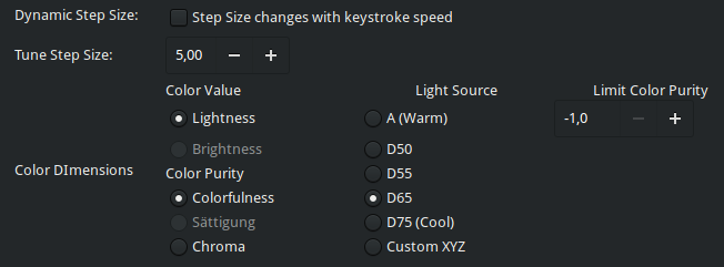
I still need to unlock the CIECAM sliders to allow selecting from the grey areas… have you had any luck with the stripes?
Actually, David Gowers totally nailed this mixing idea. I must have totally absorbed this subconsciously haha
An alternative would, I guess, use motion to control how much color got mixed in (so the action would pick the color once only, and constantly display the mixed color at the ratio determined by motion distance.) That would be incredibly comfortable IMO, but obviously would take more effort to implement.
Some updates, added ability to click the out of bounds zones and allow gamut mapping to kick in. The downside is that if your saturation value will get lost if you click in a “too bright” area. That doesn’t seem good. . . maybe I need to handle that differently and only remap the lightness for that bar instead of saturation too.
Also added a reversing preference for the pick and blend, and pressure too. Good idea for pressure, it’s pretty nice. I have pressure and distance both active so you can press for a coarse adjustment and also move slightly to fine-tune that a bit.
The picking feels pretty good if you set the throttling lower. Maybe you could decrease the throttling to 50ms for now which is about every 3rd frame on a 60hz monitor.
Will this picker also be available in the third option tab (mouse buttons) ? Because I find it more intuitive to “submit” the picking using a definite click instead of letting go of some keyboard shortcut (so like the normal color picker).
That also lead to a flaw in my idea using the pressure. If you have to lift the stylus to perform a click you can impossibly rely on the pressure anymore, so maybe it wasnt such a good idea after all, and I would not mix it with the distance functionality
Currently it seems to start at fixed 50% for mouse use and can’t go below, is that on purpose or pressure-related?
I agree that the number isn’t the most beautiful overlay, I think a simple “loading” bar would be better instead, or use the same method of the existing text overlays in the corners (e.g. when zooming), OR add such steps to a potential indicator line:
To throw some more ideas into this: Since Mypaint already has a color history, one could also just add another color slider to the list that shows a gradient between the last two picked colors. I suppose that would be easier to implement Might be less intuitive though…
I’ll continue working on it. If you checked out my branch you can see that the stripes are already there (using tiny gradients). The problem is that they have to be repainted everytime something changes “on top”. I don’t know if it’s even a performance hog, but it sure is not nice. Maybe it can be rendered and cached somehow to only be computed again for slider-resizes? I haven’t yet looked into doing that using openGL / by applying some repeating bg-image.
I wish we didn’t have to do any throttling. . .Maybe this can be a preference or calculated somehow? I want it to be usable on my old laptop, but I also want it to be nice and smooth on my desktop. I’ll make it a pref for now. . .
Well, with a slow sampling rate you have time to quickly lift the stylus between samples. Kidding, you’re right that’s a big flaw. I mean, maybe it should be disabled by default and enabled with a preference. Mouse events don’t have pressure so I made it 50% to be consistent with the drawing window. I was also looking at making pressure be a ratcheted state that only going up, so you can lift stylus cleanly. To reverse the case where you added too much pressure you could actually subtract distance maybe. Confusing? Probably.
Although, as a separate issue I’m looking at adding a option for the scroll wheel to map to “pressure” instead of just zoom and pan. This would let mice users (or any non-pressure stylus) enjoy the dynamic brushes that don’t simply map pressure to opacity-- i.e all of my brushes
That bar looks awesome. For now I think I’ll try to do the overlay in the corner like you suggested, seems easier
Not a bad idea. @troy_s suggested a pedal/flower interface showing gradients with ~8 colors from history. @achadwick has also been suggesting some good ideas on twitter, such as placing an “x” overlay on the origin so you know where you started (which wouldn’t be needed if we used a bar like your example above). Also, extending the drag model to include H,S, V modes (or whatever channel model you want)
I sped up the ciecam bars a lot by setting the bg_validity flag properly, which triggers caching of the bg. Problem is we have two backgrounds really, the stripes and the gradient on top. Should be pretty easy to extend that to two levels though. Maybe using an image is a better idea, just tile a stripe texture image?
Using the profiling tool I noticed that there are more methods calls for motion_notify_cb than I expected while dragging the cursor. Since these calls seem to be dependent on the USB polling rate, there are a lot of calls for the subsequent functions. So e.g. the function _pick_color_mode that computes all those colors gets called 125x/sec using my mouse but twice as often using my stylus, which has a polling rate of 250x/sec.
Do you know anything about this topic? Shouldn’t the subsequent calls be avoided in the first place above a certain “sane” rate. Some devices have a rate of 1000/sec (or 1ms delay) which might make things even worse…
… I just tried to globally throttle to ~125Hz in document.py but at some point if you move your stylus fast enough, you begin to see corners in brush strokes. So I guess what you did is just neccessary at some point and I dont think it makes sens to update a picked color 250x per second if you have e.g. a 60Hz monitor. The same goes for many other areas of the GUI. On the other hand brush strokes should not be throttled as much. I’m not a python or mypaint expert so idk if there is a proper way to handle this.
Funny, @achadwick talks recently about this here and gives us a generous brain-dump:
So, for drawing we definitely (maybe definitely?) want all those events, but I mentioned in that thread that we might look at a python thing called a “decorator” that would let us wrap up lots of functions with a “debouncer”, which is different than throttling apparently.
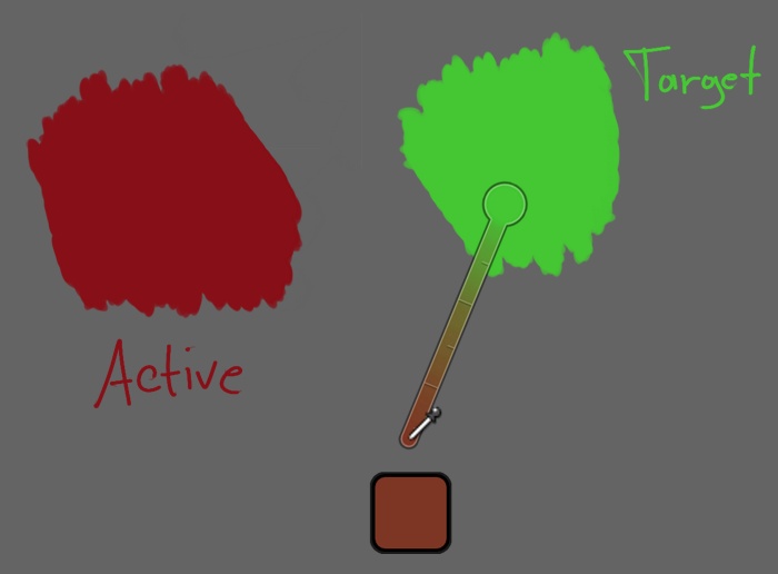
Ok so I’ve thought a lot about this, and I think something like this will be the best “function over form” option. That is, when blending two colors you really want a good comparison of the original color and the new color. The best way I can think to do that is take a swatch, cut a hole in it and place it over the other color. Also, I place it directly centered on the origin, so you know where to drag to get back to zero, and also so it is the center window for the comparisons. Oh, and it doesn’t move, it just stays right there on the origin.
Made a bunch of updates, preferences, etc. Here’s a demo video showing off the 3 main things:
contextual adjusters, color appearance matching, and the pigment blend mode
I really like it! Its much simpler and I think there is no need for any rulers, numbers like that. I also like that u made the size a setting because imo it is a bit too big (on 1920x1080 here).
Debouncing sounds a bit safer since it seems to avoid congestion but might introduce jitter if the computation time varies (I think?). It generally sounds better though. Maybe a dynamic delay between those calls might be usefull (e.g. 5ms to 50ms) so fast PCs might have a longer/normal pause while old Laptops that take longer for a function to complete might start almost right away with the next call.
Currently the problem is that often the last color-pick is skipped and thus a wrong color is shown in the preview. That should be avoided somehow when debouncing too…
Watch out for your last merge, there seem to be some old commits mixed into your master branch (especially duplicated classes in sliders.py and color.py)
Thanks! I think a spiffy bar might be nice as an option some day but this gets the job done pretty well :-). I wouldn’t want to discourage anyone from adding some eye-candy as an optional interface. I saw your edit regarding hi dpi, etc. I actually was thinking about having the default size be something like 10% of the height of the screen and then the preference can just be a multiplier for that. That would be nicer than a static pixel amount I think.
I’m thinking about some kind of automatic setting. . . where we keep track of some kind of statistic like “dropped frames” and have a slow-moving debouncer delay that just magically works. . . .
Maybe we can do something on the “leave” event so that we alway do “one more” pick and render on the way out?
Argh! Thanks for the catch! Seriously, I don’t know how I did that. git reflog to the rescue again. . .
Ok I made the preview color picker size 10% of the allocated window height, by default. You’re going to want to edit your prefs and fix that, sorry :-). Just set it to “10” for 10%, etc. Oh if you didn’t notice, the adjuster and blender overlays are double the picker overlay, to account for the big hole in the middle.
This is pretty cool, you can resize the window really small and the picker looks adorable
The color gets picked correctly on lifting the pen/mouse button, it just does not update the preview if the motion stops while holding down, so I’m not sure what that leave event would be… Maybe something like temporarly storing / queueing the latest motion-event instead of dropping it and executing it in case no following event occurs after the debounce delay?
The 10% seem like a good fit for the picker preview. Maybe make the rounded corner radius relative too? Something like 0.1 * size looks good to me.
I was thinking about how to best implement the option for darkening/brightening/etc colors using different color models via keys. This would be my current idea - having an option for the model instead of separate keybindings:
Later it would be useful to have that option (and many others of the new ones?) somewhere in the settings-dialog…